
PaperBanana
Creates AI-generated scientific diagrams tailored for researchers and academics, streamlining the design process. Offers a freemium pricing model, making it accessible for various users.
PaperBanana — official website
Imagine you’re an academic researcher working on a publication deadline for a prestigious conference like NeurIPS or ICML. You’ve spent weeks drafting your paper, but the complex diagrams and plots you need to illustrate your methodologies are proving to be a bottleneck. Traditional design tools like Adobe Illustrator can be time-consuming and require skills you might not have. This is when you start searching for an AI-powered tool that can generate high-quality, publication-ready diagrams quickly and efficiently.
PaperBanana offers a streamlined workflow for generating academic visuals, particularly useful for researchers who need to convert complex text descriptions into structured diagrams or flowcharts. One standout feature is its “Instant Methodology Diagrams,” where you input your research context, such as a paper abstract or model description, and the AI transforms it into a structured visual. You can then select from academic styles and refine elements like colors and labels to suit your publication needs. This capability helps you produce clear, standardized visuals that meet journal aesthetics, drastically reducing the time spent on design.
Key Features
- Instant Methodology Diagrams — Converts text descriptions into structured architecture diagrams instantly, crucial for clear methodological visualization.
- High-Precision Statistical Plots — Generates accurate charts from raw data using professional color palettes and typography.
- Sketch-to-Digital Transformation — Transforms rough hand-drawn sketches into vector-quality illustrations for polished results.
- Journal-Standard Aesthetics — Ensures every output is optimized for readability and meets top-tier journal requirements.
Pros & Cons
- ✓ Specifically fine-tuned for academic logic and scientific accuracy, making it ideal for research publications.
- ✓ Offers a zero learning curve, enabling users without design skills to create high-quality visuals quickly.
- ✓ Provides vector-quality outputs ready for direct insertion into LaTeX or Word.
- ✗ Requires a credit purchase for generating images, which may add costs for frequent users.
- ✗ The website doesn’t specify API access, limiting integration with other tools or systems.
For users who need highly customized diagrams or those who frequently generate bulk images, PaperBanana might not be the best fit due to its credit-based pricing model. Researchers who often collaborate across platforms or need API integration for automated workflows may find the lack of explicit API support limiting. In such cases, the costs could accumulate quickly, potentially making it an expensive option compared to competitors with flat-rate plans.
When compared to other tools like Lucidchart or Microsoft Visio, which are more general diagramming tools, PaperBanana stands out for its academic focus and AI-driven capabilities. However, if you need a tool with broader applications beyond academic and scientific diagrams, or one that integrates seamlessly with other software, a more traditional tool might be a better choice. For researchers prioritizing publication-quality scientific visuals, PaperBanana is a compelling option.
Best For
PaperBanana is best for academic researchers and scientists who produce diagrams and visuals for high-impact journals and conferences. It’s particularly suited for those working solo or within small teams who need to save time without compromising on the quality of their figures. The pricing model, with options for one-time credit purchases or subscriptions, aligns well with individual or small-scale academic projects.
PaperBanana delivers a specialized solution for those in academia needing to produce publication-ready diagrams quickly. It’s perfect for researchers who lack design skills but require high-quality visuals for conferences and journals. With its efficient workflow and academic-oriented features, PaperBanana is a valuable tool for making complex research concepts visually accessible. Given these strengths, PaperBanana is highly recommended for academic professionals focusing on scientific publications.
This review is based on publicly available information from the tool's official website and is written independently by the theWebrary editorial team. We do not accept payment for review content.
Share
Tool Overview


Browse More Tools
View all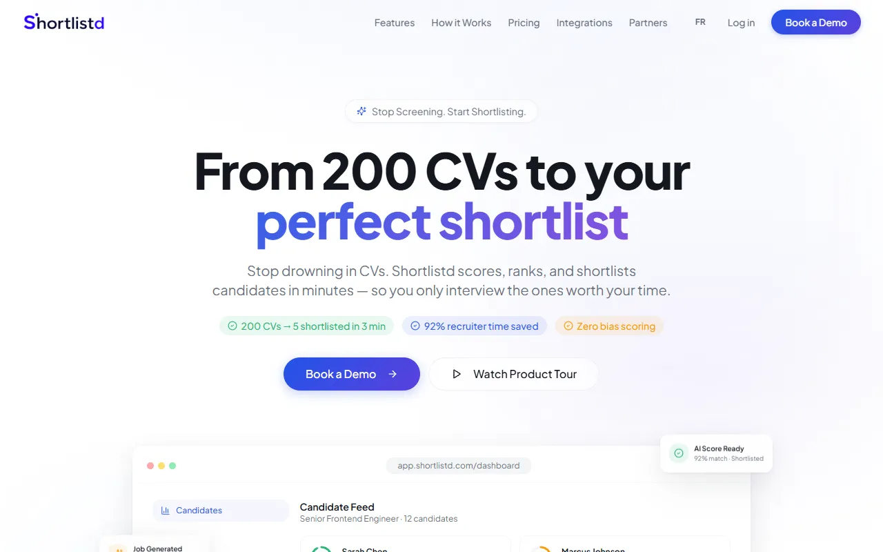
Shortlistd
AI FinanceShortlistd screens CVs and conducts voice interviews to quickly generate a tailored shortlist of candidates. Designed for recruiters, it simplifies the hiring process by delivering results in minutes. Free access is available, with paid upgrades for additional features.
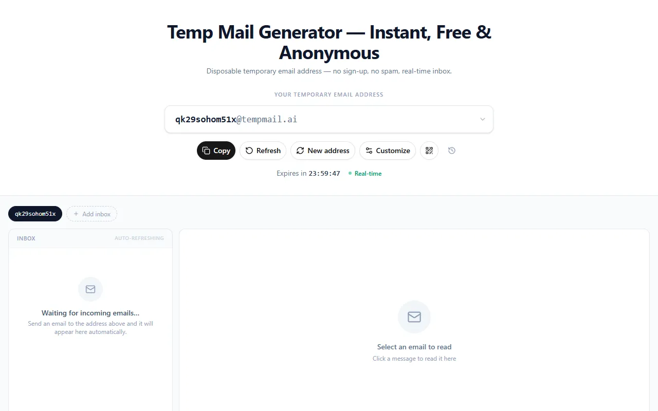
Temp Mail Generator
AI ProductivityCreate temporary email addresses instantly without sign-up, ensuring privacy and protection from spam. Ideal for users needing disposable emails for platforms like TikTok and Discord, this service is completely free.
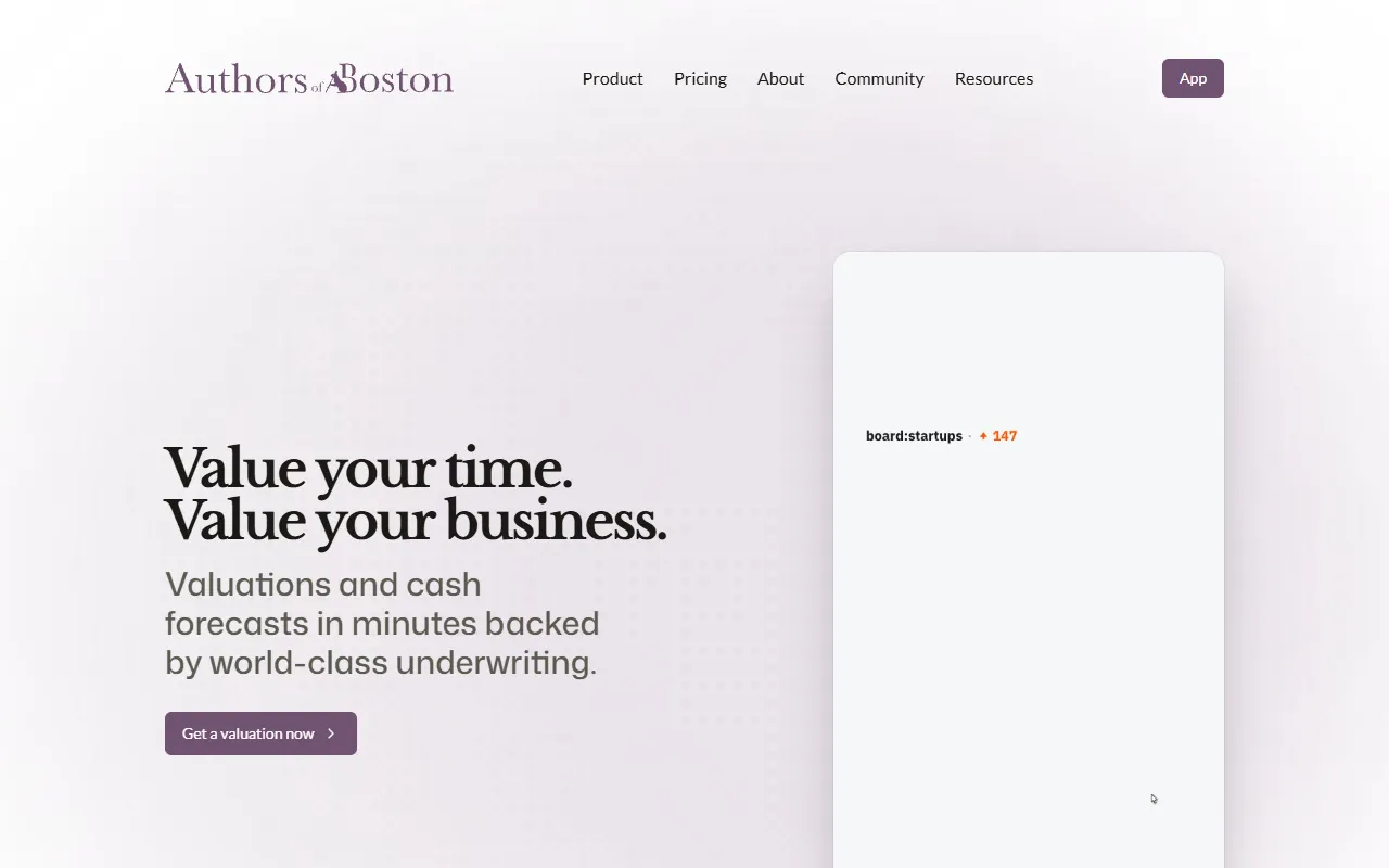
Authors of Boston
AI FinanceForecasts company valuations and cash flows quickly, enabling businesses to make informed financial decisions. Designed for early-stage companies, Authors of Boston simplifies financial modeling through data-informed choices. Free to use.
Rank-Hub
AI MarketingFinds specific changes needed to improve search traffic and provides detailed steps for implementation. Designed for users without SEO expertise, it offers a free trial with options for paid upgrades.
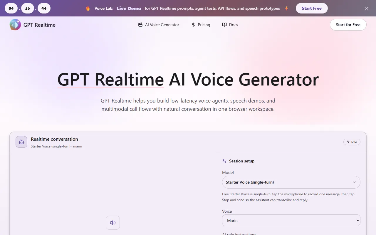
gpt realtime model
AI AudioGenerate low-latency voice agents and conduct speech-to-speech conversations with GPT Realtime. Designed for developers and businesses, it offers single-turn interactions and multimodal call flows. Free to start, with options for paid upgrades.

GoTailo
AI ProductivityGoTailo helps users streamline their productivity by organizing tasks and projects efficiently. Designed for individuals and teams looking to enhance their workflow, it offers a free version with optional paid upgrades for advanced features.
Get Your AI Tool
In Front of Thousands
Join hundreds of AI tools already featured on theWebrary. Get priority placement, a dedicated listing page, and reach an audience actively searching for AI tools.
1 Month
$5
$6
3 Months
$10
Save 50%
12 Months
$20
Save 75%